Front Page, Industry News
THE BRIEF: Starbucks turns 40 with a mid-life crisis
Wednesday January 12th 2011By TO411Daily Columnist Linda Chandler
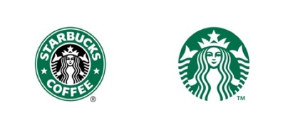
Well, of course, you turn 40 and throw everything away for a pretty face. Have you seen the new Starbucks logo, 2011?
Abandoned is the iconic green logo. Banished is the black ring that surrounded the historic “siren”.* And most curious of all, gone is the name “Starbucks.” The siren is now free to be all that she can be. Evidently, Starbucks’ President and CEO, Howard Schultz is enamored with this brand-expanding metaphor. In an online video about the undressed logo, Schultz said, “What we’ve allowed is for the siren to come out of the circle in a way that gives us the freedom and possibility to think beyond coffee. But make no mistake, we always will be the world’s leading purveyor of the highest quality of coffee.”*
“The decision set off a wave of criticism from designers, much like the Gap logo fiasco last year. Gap unveiled a new logo so bland that the company was bombarded with complaints and scrapped it,”* writes Steven Heller of NYTimes.com.
Let’s look at the old and new Starbucks logo to see what all the fuss is about.

First of all, one is struck by this: doesn’t it look like the siren’s pointing to the top of her head saying, “Doncha love the tiara?” And secondly, who is she and why doesn’t she look familiar? I had to venti somewhere. The Brief called David Soberman, Canadian National Chair in Strategic Marketing and Professor of Marketing at Rotman School of Management. Professor Soberman sums up Starbucks re-branding attempt in two words: “Not wise. These companies have a tendency to be intoxicated with their own success. Starbucks made a poor decision because one of the most important things to do is keep your brand name in.” Soberman says that broadening your brand is not a good reason to get rid of a recognizable logo, and that what was in the the center of Starbucks’ logo was not well-known. He tells me about a fiasco with Tropicana about 3 years ago, when they changed the graphics on their packaging, confusing consumers into thinking they were looking at a generic brand, and not Tropicana. “Their re-packaging efforts cost the company 20-share points,” Soberman recalls. When Nike removed their name, we all recognized the Swoosh. Same with Apple. But with Starbucks’ new deconstructed logo, (liberated from all those nagging elements of successful branding), a visceral connection disconnects for me. The old Starbucks logo accompanied me through all of my caffeinated life – from Los Angeles to Toronto, to new jobs, and long drives, and confidential talks (at Starbucks!), and to a shared experience of one perk a day. An over-priced latte.
This is what The Brief concludes: when re-branding (as Coca Cola taught us), a company needs to reconsider the consumer’s personal narrative as well. I want my old cup back. It runneth over.
Cue: Jimmy Kimmel’s take on Starbucks’ new logo:
*The Siren has been the symbol at the center of the Starbucks brand mark for 40 years, and yet has never been used as a central figure or story of the Starbucks brand heritage. The connection from the Siren mermaid and the Starbucks brand name was never widely communicated to consumers. Sure, it was common knowledge in branding circles (and among English lit majors) that the name comes from a coffee-swilling old salt in the novel Moby Dick. And industry insiders know the mermaid logo is derived from Seattle’s seafaring history. But most Starbucks customers have grown to love this unique name and logo without much context or explanation. http://blog.interbrand.com/blog/post/2011/01/06/Starbucks-Rebrand-At-Age-40-a-Sirene28099s-Coming-Out-Party.aspx
http://www.nytimes.com/2011/01/09/weekinreview/09heller.html/
—–
Comment to Linda at this address: thebrief@to411.com.
LinkedIn // Facebook // Twitter
Front Page, Industry News
THE BRIEF: Starbucks turns 40 with a mid-life crisis
Wednesday January 12th 2011By TO411Daily Columnist Linda Chandler
Well, of course, you turn 40 and throw everything away for a pretty face. Have you seen the new Starbucks logo, 2011?
Abandoned is the iconic green logo. Banished is the black ring that surrounded the historic “siren”.* And most curious of all, gone is the name “Starbucks.” The siren is now free to be all that she can be. Evidently, Starbucks’ President and CEO, Howard Schultz is enamored with this brand-expanding metaphor. In an online video about the undressed logo, Schultz said, “What we’ve allowed is for the siren to come out of the circle in a way that gives us the freedom and possibility to think beyond coffee. But make no mistake, we always will be the world’s leading purveyor of the highest quality of coffee.”*
“The decision set off a wave of criticism from designers, much like the Gap logo fiasco last year. Gap unveiled a new logo so bland that the company was bombarded with complaints and scrapped it,”* writes Steven Heller of NYTimes.com.
Let’s look at the old and new Starbucks logo to see what all the fuss is about.

First of all, one is struck by this: doesn’t it look like the siren’s pointing to the top of her head saying, “Doncha love the tiara?” And secondly, who is she and why doesn’t she look familiar? I had to venti somewhere. The Brief called David Soberman, Canadian National Chair in Strategic Marketing and Professor of Marketing at Rotman School of Management. Professor Soberman sums up Starbucks re-branding attempt in two words: “Not wise. These companies have a tendency to be intoxicated with their own success. Starbucks made a poor decision because one of the most important things to do is keep your brand name in.” Soberman says that broadening your brand is not a good reason to get rid of a recognizable logo, and that what was in the the center of Starbucks’ logo was not well-known. He tells me about a fiasco with Tropicana about 3 years ago, when they changed the graphics on their packaging, confusing consumers into thinking they were looking at a generic brand, and not Tropicana. “Their re-packaging efforts cost the company 20-share points,” Soberman recalls. When Nike removed their name, we all recognized the Swoosh. Same with Apple. But with Starbucks’ new deconstructed logo, (liberated from all those nagging elements of successful branding), a visceral connection disconnects for me. The old Starbucks logo accompanied me through all of my caffeinated life – from Los Angeles to Toronto, to new jobs, and long drives, and confidential talks (at Starbucks!), and to a shared experience of one perk a day. An over-priced latte.
This is what The Brief concludes: when re-branding (as Coca Cola taught us), a company needs to reconsider the consumer’s personal narrative as well. I want my old cup back. It runneth over.
Cue: Jimmy Kimmel’s take on Starbucks’ new logo:
*The Siren has been the symbol at the center of the Starbucks brand mark for 40 years, and yet has never been used as a central figure or story of the Starbucks brand heritage. The connection from the Siren mermaid and the Starbucks brand name was never widely communicated to consumers. Sure, it was common knowledge in branding circles (and among English lit majors) that the name comes from a coffee-swilling old salt in the novel Moby Dick. And industry insiders know the mermaid logo is derived from Seattle’s seafaring history. But most Starbucks customers have grown to love this unique name and logo without much context or explanation. http://blog.interbrand.com/blog/post/2011/01/06/Starbucks-Rebrand-At-Age-40-a-Sirene28099s-Coming-Out-Party.aspx
http://www.nytimes.com/2011/01/09/weekinreview/09heller.html/
—–
Comment to Linda at this address: thebrief@to411.com.
LinkedIn // Facebook // Twitter
Leave a Reply
Front Page, Industry News
THE BRIEF: Starbucks turns 40 with a mid-life crisis
Wednesday January 12th 2011By TO411Daily Columnist Linda Chandler
Well, of course, you turn 40 and throw everything away for a pretty face. Have you seen the new Starbucks logo, 2011?
Abandoned is the iconic green logo. Banished is the black ring that surrounded the historic “siren”.* And most curious of all, gone is the name “Starbucks.” The siren is now free to be all that she can be. Evidently, Starbucks’ President and CEO, Howard Schultz is enamored with this brand-expanding metaphor. In an online video about the undressed logo, Schultz said, “What we’ve allowed is for the siren to come out of the circle in a way that gives us the freedom and possibility to think beyond coffee. But make no mistake, we always will be the world’s leading purveyor of the highest quality of coffee.”*
“The decision set off a wave of criticism from designers, much like the Gap logo fiasco last year. Gap unveiled a new logo so bland that the company was bombarded with complaints and scrapped it,”* writes Steven Heller of NYTimes.com.
Let’s look at the old and new Starbucks logo to see what all the fuss is about.

First of all, one is struck by this: doesn’t it look like the siren’s pointing to the top of her head saying, “Doncha love the tiara?” And secondly, who is she and why doesn’t she look familiar? I had to venti somewhere. The Brief called David Soberman, Canadian National Chair in Strategic Marketing and Professor of Marketing at Rotman School of Management. Professor Soberman sums up Starbucks re-branding attempt in two words: “Not wise. These companies have a tendency to be intoxicated with their own success. Starbucks made a poor decision because one of the most important things to do is keep your brand name in.” Soberman says that broadening your brand is not a good reason to get rid of a recognizable logo, and that what was in the the center of Starbucks’ logo was not well-known. He tells me about a fiasco with Tropicana about 3 years ago, when they changed the graphics on their packaging, confusing consumers into thinking they were looking at a generic brand, and not Tropicana. “Their re-packaging efforts cost the company 20-share points,” Soberman recalls. When Nike removed their name, we all recognized the Swoosh. Same with Apple. But with Starbucks’ new deconstructed logo, (liberated from all those nagging elements of successful branding), a visceral connection disconnects for me. The old Starbucks logo accompanied me through all of my caffeinated life – from Los Angeles to Toronto, to new jobs, and long drives, and confidential talks (at Starbucks!), and to a shared experience of one perk a day. An over-priced latte.
This is what The Brief concludes: when re-branding (as Coca Cola taught us), a company needs to reconsider the consumer’s personal narrative as well. I want my old cup back. It runneth over.
Cue: Jimmy Kimmel’s take on Starbucks’ new logo:
*The Siren has been the symbol at the center of the Starbucks brand mark for 40 years, and yet has never been used as a central figure or story of the Starbucks brand heritage. The connection from the Siren mermaid and the Starbucks brand name was never widely communicated to consumers. Sure, it was common knowledge in branding circles (and among English lit majors) that the name comes from a coffee-swilling old salt in the novel Moby Dick. And industry insiders know the mermaid logo is derived from Seattle’s seafaring history. But most Starbucks customers have grown to love this unique name and logo without much context or explanation. http://blog.interbrand.com/blog/post/2011/01/06/Starbucks-Rebrand-At-Age-40-a-Sirene28099s-Coming-Out-Party.aspx
http://www.nytimes.com/2011/01/09/weekinreview/09heller.html/
—–
Comment to Linda at this address: thebrief@to411.com.
LinkedIn // Facebook // Twitter


